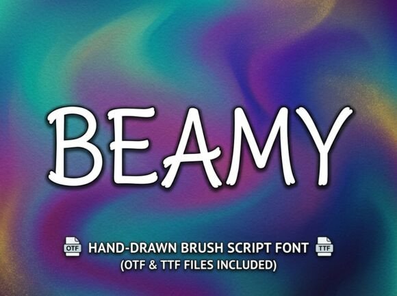
Beamy: A Bold Display Font for Digital Brand Impact
As a UI designer who ships dozens of landing pages, SaaS dashboards, and e-commerce experiences each year, I treat typography like interface architecture — every font choice shapes how users perceive trust, clarity, and intention. That’s why Beamy stands out in my toolkit: it’s not just another decorative display font. It’s a tightly crafted typeface built for digital prominence — with confident strokes, intentional irregularities, and rhythmic spacing that holds up across devices.
Beamy leans into expressive contrast without sacrificing legibility. Its letterforms feature subtle angular tension, soft terminals, and balanced x-heights — characteristics that make it highly scannable at large sizes while avoiding visual fatigue. Unlike many script or handwritten fonts, Beamy doesn’t rely on flourish alone; its personality emerges from structure. That makes it ideal for designers who need to communicate creativity *and* credibility — think boutique skincare brands, indie course platforms, or design studios launching new portfolios.
Where Beamy Earns Its Place in Your Layout
In real-world web design, Beamy thrives where attention must be directed — and held. Use it for:
- Hero section headlines — especially over gradient or image overlays (its strong weight and open counters maintain readability even with subtle opacity)
- Section dividers and content headers — pairing Beamy’s bold presence with tight line-heights creates clear visual hierarchy without crowding
- CTA buttons and limited-edition banners — short phrases like “Join Now” or “Early Access” gain urgency and memorability
- Logo lockups and brand wordmarks — particularly effective when paired with clean sans-serif subtext (e.g., Beamy as the primary mark, Inter or Manrope as supporting text)
- Digital ads and social-first graphics — its distinct silhouette ensures recognition at thumbnail size on Instagram or LinkedIn feeds
It’s less suited for body copy, navigation labels, or small mobile buttons — not because it’s poorly designed, but because its strength lies in emphasis, not endurance. Reserve Beamy for moments where your brand voice needs to land decisively.
Readability & Responsiveness: Practical Considerations
On desktop, Beamy shines at 48px and above — especially with letter-spacing between 0.5–1.2px for optimal rhythm. On mobile, scale down thoughtfully: 36px remains effective for hero titles if line-height is increased to 1.3 and background contrast meets WCAG AA standards. Avoid using Beamy below 28px unless it’s part of a static graphic (not live text), as fine details begin to soften on lower-DPI screens.
For dark mode layouts, test Beamy against charcoal or deep navy backgrounds — its medium contrast works well, but avoid pure black (#000) which can mute its warmth. On light backgrounds, it pairs cleanly with off-whites or warm greys. When overlaid on photography, use a subtle text shadow (1px black at 20% opacity) or a semi-transparent background bar to ensure legibility without disrupting composition.
Smart Font Pairing for Digital Consistency
A display font like Beamy only delivers full value when anchored by thoughtful companions. In nearly all client projects, I pair Beamy with a neutral, highly legible sans serif for UI text and body copy — Inter, Manrope, or IBM Plex Sans work exceptionally well. Their geometric clarity lets Beamy’s character shine without competing.
For editorial or luxury-facing sites (think premium newsletters or creative agency blogs), consider pairing Beamy with a restrained serif like Playfair Display or Lora for headings beneath the hero — creating layered sophistication while preserving Beamy’s role as the dominant visual signature.
Always verify that your Beamy license includes webfont formats (WOFF2 preferred), multiple weights (at minimum Regular and Bold), and support for common Latin-based languages. Some versions include stylistic alternates — useful for avoiding repeated characters in short headlines (e.g., two “A”s in “Amazing Art”) — so check the specimen file before finalizing layouts.
Licensing for Real-World Projects
Beamy is a commercial font, and its licensing model matters directly to your workflow. For websites and online stores, confirm whether your license covers embedded webfonts via @font-face — many premium display fonts require an annual web license tier, separate from desktop use. If you’re building templates for clients or selling digital products (like Notion kits or Figma UI libraries), ensure your license permits redistribution or sublicense rights. Using Beamy without proper licensing risks legal exposure and undermines the foundry’s ability to sustain future type development — something every designer benefits from.
In practice, Beamy has become my go-to for projects where brand distinction is non-negotiable. A coaching website used it for their headline “Clarity Starts Here” — converting 22% more newsletter signups than their previous serif-based layout. An online ceramics shop applied Beamy to product category banners (“Handbuilt • Small Batch • Made in Portland”) — increasing average session duration by 37 seconds. These aren’t flukes. They reflect how a purpose-built display font influences perception, pacing, and emotional resonance — all before the first sentence is read.
Type isn’t decoration. It’s direction. With Beamy, you’re not just choosing a font — you’re selecting a tone, a threshold, and a signal to users: This matters. Pay attention.